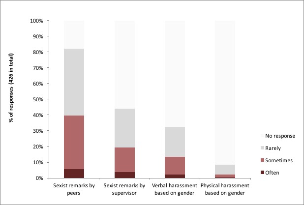
The charts in Christina Richey's AAS presentation of the CSWA survey of harassment in the astronomy community all look something like this:

Factually, there's nothing wrong with this graph, but it does give a misleading visual impression of the magnitude of the problem of physical harassment that was expressed by the respondents to the survey. As with all visual representations, the important thing is to get the scale right, so that the data is put in proper "perspective", i.e., so that it is kept in proportion.
But notice the bottom axis, which offers a kind of ruler, or precisely, a scale. It goes from 0 to 40. But the 40 doesn't actually represent anything significant in the data. That is, the 36 people who reported having experienced physical harassment are not taken out of a group of forty people, and the 4-person blank space to the right of the bar therefore doesn't represent any particular part of the data. Rather, the 36 people represent a subset of the 426 respondents, i.e., as the number to the right of the bar (rightly) says, they represent 9% of the sample.
Moreover, notice the way the breakdown of the 36 responses ("rarely" = 27, "sometimes" = 8, "often" = 1) are stacked, so that "rarely" is extended with "sometimes" and then with "often". Since the blank space beyond "often" is, properly speaking, "no response" and, by implication (or my presumption, if you will), "never", the order is somewhat, let's say, jarring. It would be better to have "often" first, shading off into "sometimes", shading off into "rarely", and finally shading off into the empty space of "never".
What I would have liked to see is a chart that looks more like the following:
Here the problem is graphed so that the "often or sometimes" are grouped at the bottom in a way that lets us compare the prevalence of the different kinds of reported behavior, with "often" (which I think is the best indicator of "severe or pervasive" behavior) clearly emphasized. "Rarely or never" are then shaded off into each other to account for the remainder of the sample, giving us a clear sense of how many people this doesn't happen to, and how rarely it happens when it does.
The CSWA survey has clearly been presented to have the opposite effect. I've said in a previous post that, since sexual harassment is normally defined in terms of the frequency of behaviors (though, yes, rare and very severe behaviors can count too), it is misleading to characterize its prevalence by counting "often", "sometimes", and "rarely" equally and then say that "82% of astronomers," for example, "have heard sexist language used by peers." We really need to know the relative frequency of such observations to learn anything of relevance to the problem of harassment.
I think my criticism is best expressed by my proposed graph above alongside the relevant slides in Richey's presentation. Which is why I've written this post.
[Acknowledgement: I'm grateful to @ticobas for his invaluable assistance in analyzing the CSWA presentation and making the alternative chart.]
No comments:
Post a Comment